Some of these ideas take a Saturday and a paintbrush; others need a contractor and a saw.
The one that fits depends on whether your main problem is the facade looking flat, the upstairs feeling dark, or the whole house reading as plain from the street.
I spent time with Brick and Batten’s examples and the Hardie palettes while putting this together, and the detail that stuck with me is the $700–$1,200 per window Andersen charges for a double-hung line sized to Cape proportions, installation not included.
[link-whisper-related-posts]1. Shingle Siding
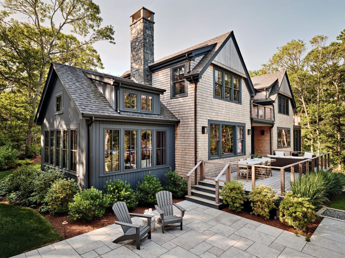
Shingle siding is the look most people picture when they think Cape Cod, and cedar shakes weathered to silver-grey are about as traditional as it gets.
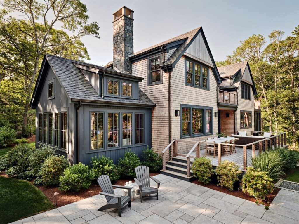
Natural cedar on the main body, a darker grey wing, and stone chimney work breaks up the wall line without fighting the style.
I looked into doing this on my own place a few years back and learned the hard way that not all shingles are equal.
Cedar needs refinishing every few years if you want to keep that warm tone; let it go and you get the weathered look, which some homeowners prefer.
James Hardie makes a fiber-cement shingle that reads almost identical from the street and skips the maintenance cycle entirely.
Board-and-batten or clapboard can work too if the rest of the house keeps the Cape Cod proportions: steep roof, centered door, quiet trim.
A full shingle job runs toward the top of most siding budgets. If yours is shot and you are replacing anyway, the upgrade to cedar or a good composite is worth pricing out.

PREFINISHED WHITE CEDAR SHINGLES – CAPE COD GRAY – Factory-applied two-coat finish gives consistent color and durability out of the box, so there is no on-site staining and installation is faster.

SHINGLE SIDING OUTSIDE CORNERS – Smooth, uniform look of premium cedar perfection shingles in a low-maintenance composite exterior corner.

Utility Grade Shingle for Under Coursing of Double Coursed Sidewalls and Starter Shingles
2. Trim and Shutters
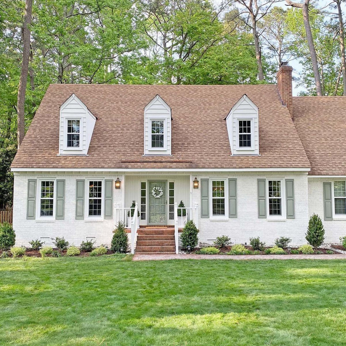
Trim and shutters do more work on a Cape Cod than on almost any other style because the houses themselves are so plain.
Sage green shutters against white paint make the windows read larger, give the facade layers, and stop the whole thing from looking like a plain box.
White trim is the baseline, and on most Capes it is the right call. Where I would deviate is the shutters.
Black reads formal; green, blue, or red reads coastal and cottage. The Valspar palette leans vivid, and I think that is the move on a white or grey body.
The only colour that gives me pause is a shutter painted to contrast without enough saturation; it can look like a budget fix rather than a choice.
If you already have shutters, pulling them for sanding and a new coat is a weekend job. Replace missing ones before you paint so the colour decision covers everything at once.

Hang decor for your favorite holidays and remove when the holidays change with no damage.
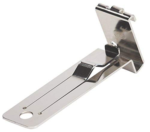
Strong, one-piece tempered spring steel construction.

including: 2 x Siding Overlap Gauge Set
3. Muted Blues
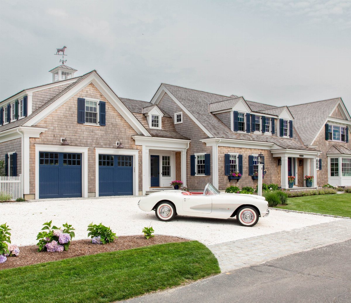
Muted navy on shutters and garage doors is a specific choice that reads differently than a bold cobalt or a soft sky blue.
Keep everything else neutral: grey shingles, white trim, gravel drive. The blue is present but quiet, more suggestion than statement.
I like this range for Capes because the style started in coastal New England where nothing stays saturated long. Salt, fog, and winter grey all fade colour toward this register eventually, so starting there feels honest to the architecture.
The Hardie palette runs to muted blues, warm greys, and yellows that have been knocked back; paired with white or dark trim, the combinations stay legible without shouting.
Testing matters more with blue than with neutrals.
The same navy reads almost black on a cloudy day and can turn slightly purple in direct sun. Get a sample board and move it around the facade at different hours before you commit.

Amish Style painted mailbox

Window Frame Trim: This decorative wood strip measures 11.79 x 0.24 in and is designed for window frames and screens, helping add a finished look while supporting DIY window frame trim projects for interior or exterior use

Cute and fully fuctional country barn mailbox that will keep your mail dry
4. Front Porch Additions
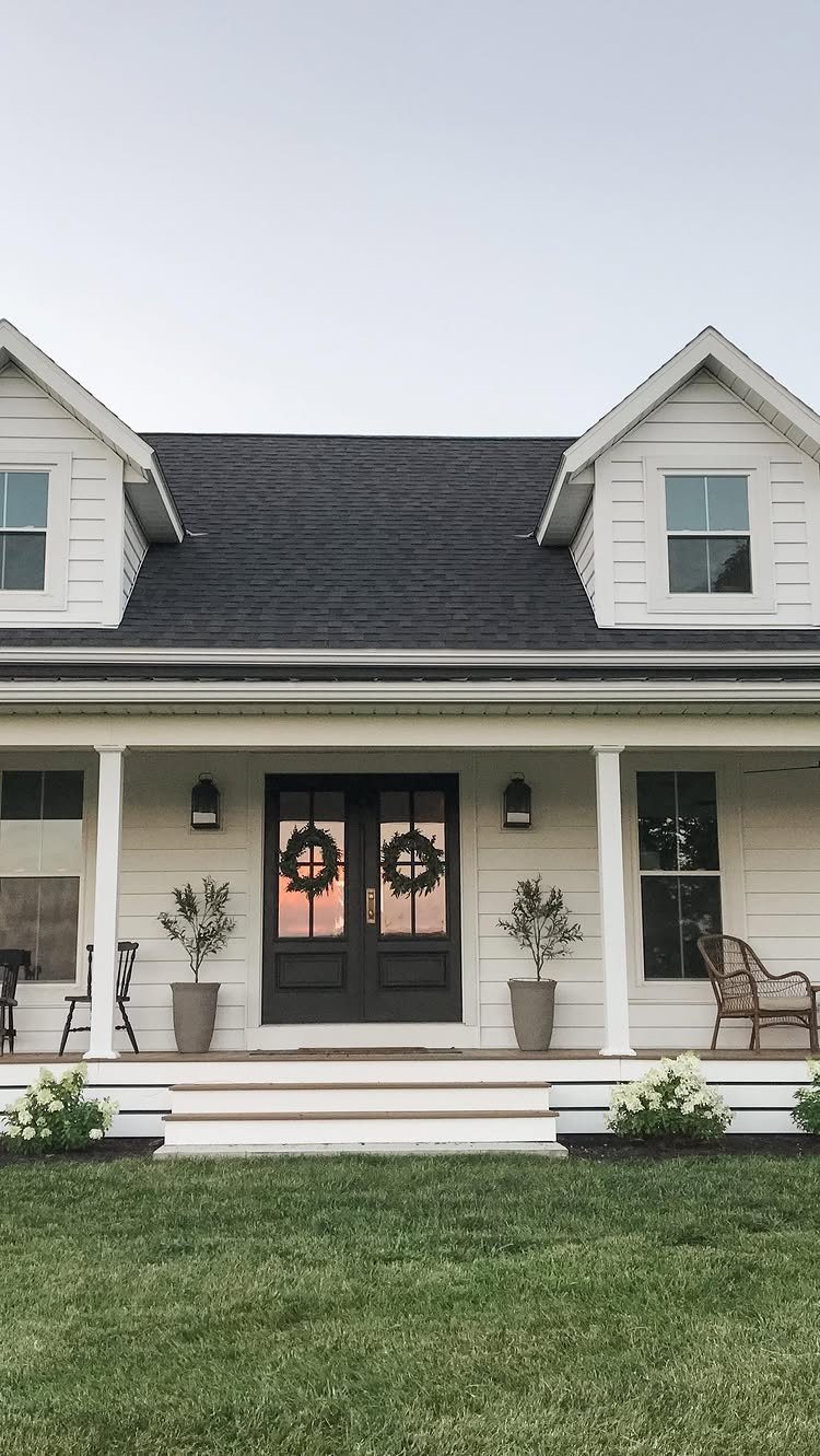
A covered front porch turns a flat facade into an entry sequence: approach, step up, pause at the door. Columns and a small roof add structure, and dark double doors give the porch a focal point that pulls you in.
Most original Capes had minimal porches or none at all; the style was built for weather tightness, not outdoor living. Adding one now means deciding how traditional to keep it.
Revere Pewter on body and White Dove on columns is warm without being fussy; Rockport Gray on shutters ties it together. I would keep the columns simple and square; turned spindles start reading Victorian, which is a different house entirely.
The cost jumps if you need to extend the roofline. A portico with its own small gable, supported by posts anchored to the foundation, is less invasive and often enough to get the effect.

One Piece Injection Molded Polypropylene Construction

Outdoor Hardware Supply 9" x 27" shutters are manufactured from UV-resistant vinyl, resisting chipping and no fading over time. Louvers Do not allow air passage - Decorative Only

Vinyl shutters included UV-additives that protect from fading.
5. Double-hung Windows
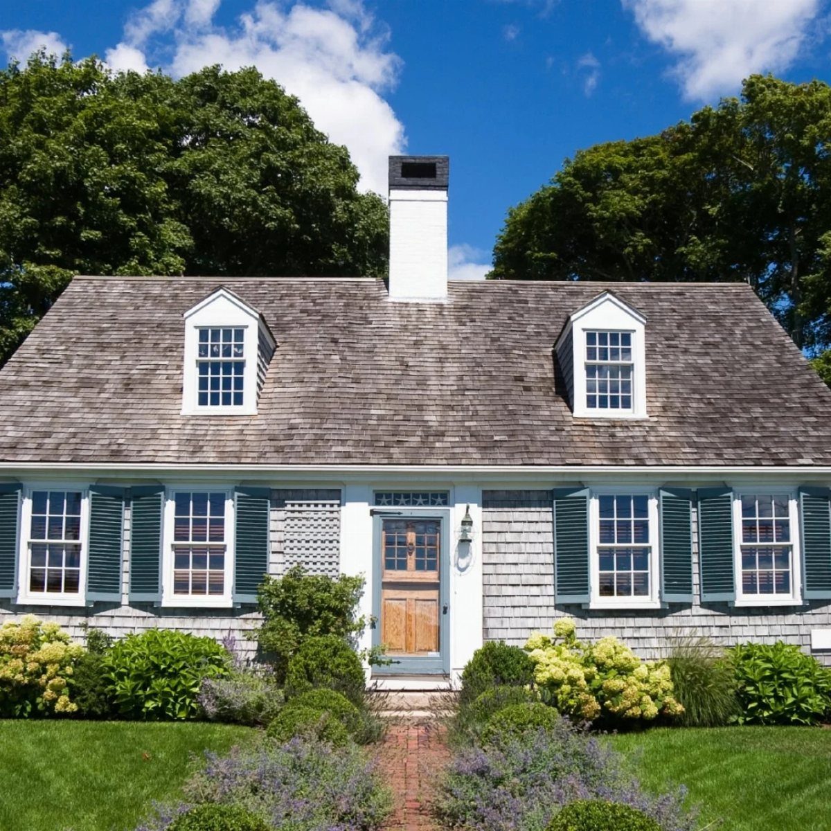
Small windows were a climate strategy on early Capes, not a choice about light. Double-hung windows with divided lights look right when the shutters appear functional, like they could actually close over the opening.
Modern insulated glass removes the original reason to keep windows tiny, so enlarging them is the single biggest change you can make to how the house lives inside.
Andersen makes a double-hung line specifically sized for Cape proportions if you are replacing. The cost runs $700–$1,200 per window plus installation, which adds up fast on a full house.
I would prioritize the street-facing facade and any room you spend evening time in.
Window boxes under the sills add depth without structural work; plant for height in back, spillers in front, and keep the box painted to match trim for a cleaner look.

One Piece Injection Molded Polypropylene Construction

Vinyl shutters included UV-additives that protect from fading.
6. Dormer Windows
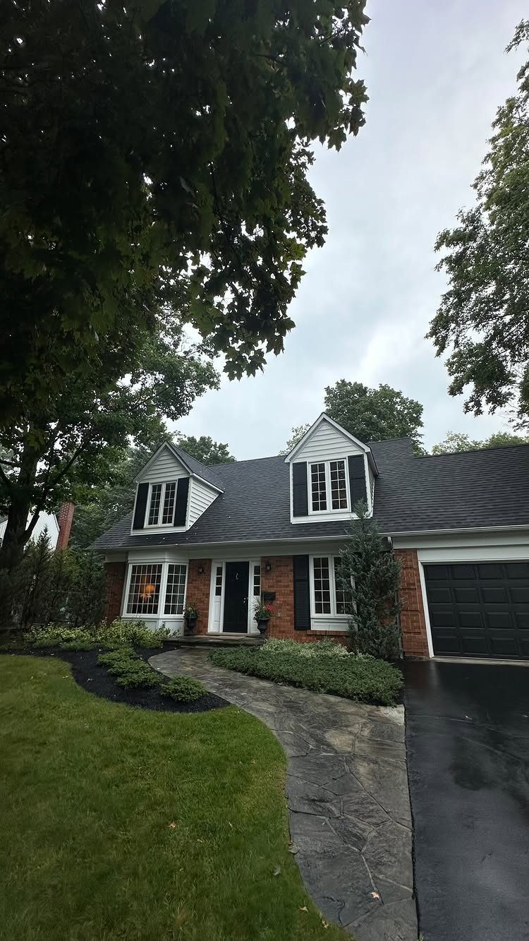
Dormers solve 2 problems original Capes had: low headroom upstairs and almost no natural light in the half-story. White gabled dormers with black shutters against brick give satisfying symmetry without rigidity.
Early Capes often had no dormers at all; the loft stayed unfinished.
Adding them now means cutting into the roof structure, so this is not a casual project. A usable second floor and exterior detail breaks up what can be a long, plain roof plane.
Brick and Batten’s example uses Sherwin Williams Urbane Bronze on the dormer siding for contrast, which reads modern; painted to match the body, the same shape disappears and keeps the roofline quieter.
I would check attic framing before falling in love with a specific dormer style. Some rafter layouts accommodate the opening easily; others need reframing that pushes the budget into addition territory rather than renovation.

Color-Matched, Cape Cod Gray (soft weathered grey) - formulated to match Waska cedar shingle siding for seamless touch-ups

Patented PanelThermometer for precise installation True Texture finish

✅ #1 ROYALS GRADE – PREMIUM APPEARANCE QUALITY Royals grade shingles offer a high‑quality appearance with fewer imperfections, making them ideal for visible exterior siding and architectural projects.
7. Cape Cod Architectural Features
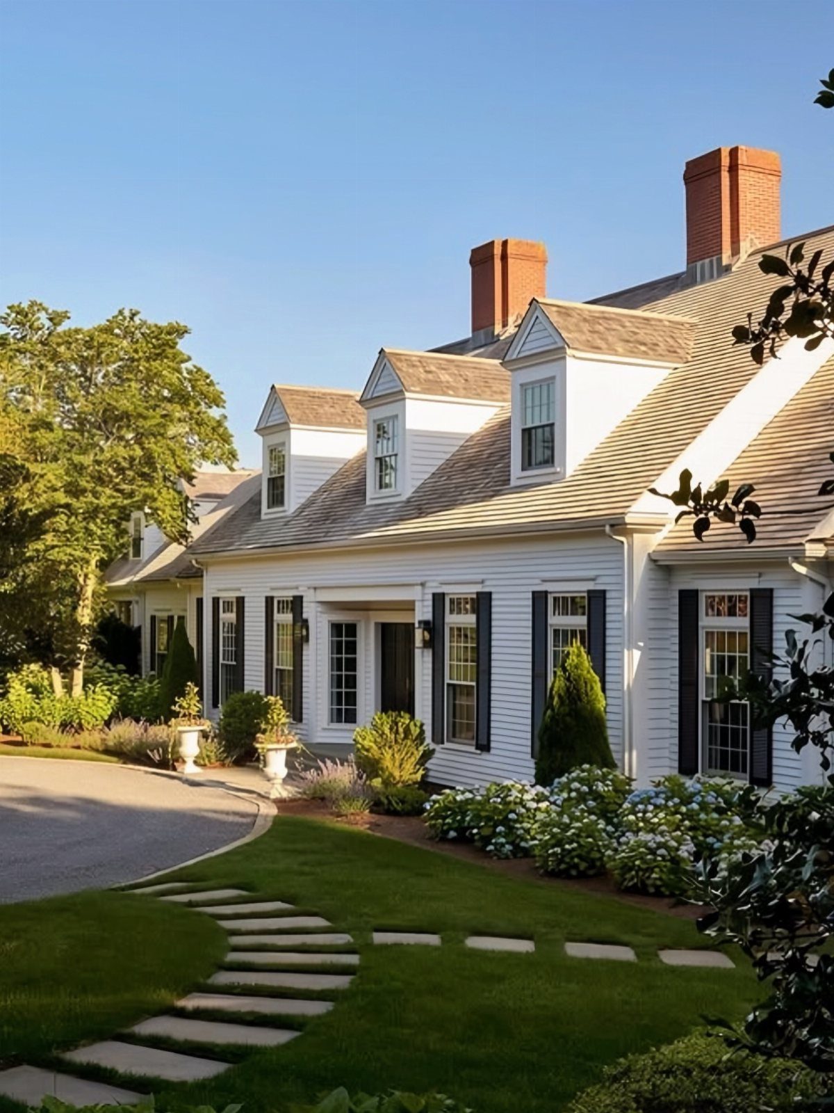
The low, broad frame and steep-pitched gable roof are not decorative choices; they shed snow and hold heat in a climate that punished anything less.
Central chimneys kept every room within reach of the hearth, and the near-perfect symmetry made the build repeatable with hand tools.
Original Capes were spare to the point of plain. Modern versions loosen this up, but the proportions still carry the style: a centered door, windows balanced left and right, minimal trim that reads as shadow lines rather than ornament.
Burgundy siding with white trim works if the color stays deep enough; board-and-batten mixed with clapboard adds texture without breaking the rules.
I would check the roof pitch before calling anything a Cape Cod update. Below a certain roof pitch, the silhouette goes generic colonial, and no amount of shutter color brings it back.

Fitment: The siding hangers for hardie fit 5/16" thick siding board. Siding tools for Hardie fiber cement LP SmartSide Cedar lap siding board fit all standard-width siding planks including hardie board, old/ new fiber cement siding, vinyl siding and wood siding board.


No distortion or compression
8. White Siding with Green Door
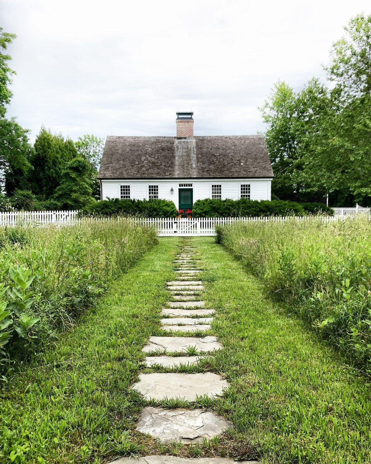
A green door on white siding is the specific combination that reads Cape Cod from the curb.
The white picket fence repeats the siding color so the door stays the single accent; anything more and the eye has nowhere to rest.
Hardie’s White Bungalow in their Dream Collection runs warm, which matters against northern light that can turn cool whites sterile.
Sherwin Williams Alabaster on trim, columns, and chimney brick keeps the layers distinguishable without introducing new color. Stone veneer on porch skirting adds weight at the base so the white does not look like it is floating.
The door itself wants to be forest green, not sage or mint; muted enough to feel weathered, dark enough to read from the street.
A mid-tone green can look like a mistake in afternoon shade, so test at dusk when most arrivals happen.
White fences need annual washing in humid climates; budget that time or switch to a composite picket that carries the same look.
Maintaining Cape Cod Charm
Modern updates work best when they freshen what is already there rather than disguise it. Fresh paint, new siding, or a clearer path to the front door can update the whole look without changing the roof pitch or the footprint.
Dark trim against clapboard reads completely different from the classic white, and losing the shutters puts all the attention on the window frame itself. Those choices read as updated, not abandoned; the house still looks like itself from the street.
Mixing lap and shingle siding in different sections adds dimension without breaking the style rules. Bold blues or greens can work, but the architecture has to stay recognizable: centered door, balanced windows, steep gable above.
Choosing Exterior Colors
Warm whites, soft neutrals, charcoal tones, greiges, and deeper shades like near-black or bronze all work on a modern Cape. The right choice depends on what is already fixed: roof, siding, brick, stone.
Neutral palettes can carry texture instead of color. Shake, board-and-batten, and smooth paneling layered in beige or cream add detail without introducing hue.
The notes from brickandbatten mention bold blues and greens as striking contrasts, though I would treat those as accents: a door, shutters, maybe a wing. On the main body, the Cape tradition is restraint.
Historical Significance
The first Cape Cod houses appeared in the 1600s, built by settlers who adapted British forms to New England winters. Cedar shingles on those roofs helped keep out cold that could drop to −10 °F in January and February.
The post-war housing boom of the 1940s and 1950s is the wave that filled New England neighborhoods and spread the look nationwide.
Early Cape Cod houses were described as half-houses, and they were 16 to 20 feet wide.
Differences from Other Styles
A Cape Cod and a Dutch Colonial are easy to confuse until you look at the roof.
A Cape runs one straight gable slope to the ridge; Dutch Colonials break into a gambrel with a second, steeper pitch below. That single difference changes the whole silhouette.
Capes share the bungalow’s modest scale but not its asymmetry.
The face stays flat and centered, windows matched left and right of the door, no bump-out entry to catch the eye. Real estate agents in Massachusetts call it the house everybody drew at five: simple, square, no frills.
Steep roofs cleared debris before it accumulated. Those were climate strategies, not decorative choices, and they still read as character today.
Frequently Asked Questions
What are the best exterior colors for Cape Cod homes?
Modern Capes look good in warm whites, charcoal, greige, or a near-black that reads as bronze in certain light.
The older palette leans on colors that look like the coast faded them: muted blue, warm gray, yellow knocked back by salt and fog.
I would keep bold blues and greens to accents like doors and shutters rather than the main body, since the Cape tradition is restraint.
What are the disadvantages of a Cape Cod house?
The original design prioritized weather tightness over space and light. Low ceilings held heat but can feel cramped, and the small windows that made sense for insulation leave the interior darker than most people prefer now.
The half-story under the steep roof has limited headroom and almost no natural light without dormers.
Most Capes in neighborhoods now were built fast in the 1940s and 1950s, so the systems inside can be just as dated as the floor plan.